Process Report
I Loved Willie was the name of the narrative created. This narrative was written based on To Kill A Mockingbird and the research conducted around institutional racism in the Jim Crow South. Before the narrative was written, a proposal for the story was created and approved. After the creation, drafting, and revision of the narrative, it was time for promotion. The promotion required a production calendar to be made and followed in order to keep work flow continuous and organized. Along with this production calendar was a promotional plan assignment, which was crafted in order to map out how the target audience was to be reached through social media. Specifically, the audience targeted were those who displayed tendencies to enjoy reading, especially those who made posts that suggested their interest in themes similar to those contained in I Loved Willie. For the completion of this product, the audience’s values and emotions were tapped into, including appeals to pathos. I Loved Willie contained a friendship forcibly broken up. As anyone would be, the emotional trauma that comes along with something like that happening was exploited in order to strike an emotion with the reader. The genre conventions of this story included childhood adventure, exploiting emotion, and some characters having racist tendencies.
In terms of design, two promotional images were created effectively in order to not only catch the audience’s eye, but to encourage clicks on the website. One of the images created was used as the “logo” of this project. It acted as the profile picture for all social media accounts in order to have a consistent and recognizable image associated with the narrative. The title of the story was in large print on this logo so people would see it and immediately know the title. A Scale of Justice was included in the logo because the courtroom was not only a pivotal scene in the story, but the main source of institutional racism in the narrative that so much research went into recognizing. On the top left corner, a sun is found on the logo. This references the scene in the narrative right before Willie and Jackson go back into the courtroom to hear the final decision of the case. Secondly, the other promotional image was in the form of a flyer. The flyer had a stack of books on it with text going down each spine, giving details about the narrative and where to find it. This type of media was chosen because it clearly portrayed that the product was a story and where to access it. In order to create these pieces of art, the online software Canva was utilized. From conception to completion, the project did not change much, save for some revisions on the narrative. Time management was the definitely a challenging part about this project. However, holding oneself accountable with the production calendar was a big help. Even if a day of production was missed, the production that was missed would still be on the calendar so it could be completed the next day. Versus Project 2, Project 3 was a lot more focused on the bigger picture, not just the composition. Social media and promotion management was not even present in Project 2 and something that made Project 3 more difficult. Before the start of this project, I would have given myself the advice of keeping on top of social media and drafting posts. Having content ready to go is much easier than thinking of it in a pinch.
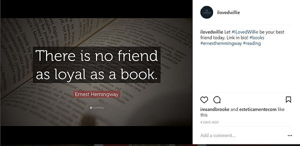
The avenues chosen to promote on were Instagram, Facebook, and Twitter. My plan to draw attention to my narrative was primarily to create solid content. If content is lackluster, no one would be interested anyway. Another vital part of my promotional plan to draw attention was following people and commenting on their posts. These people were found by searching hashtags of similar themes to my story and about reading itself. Some hashtags used were #reading, #shelfie, #friends, #raceless, #blm, #author and #ILovedWillie to name a few. In my experience, Instagram was the most successful platform. I followed 150+ people on each platform in attempts for a follow back. However, if no follow back was achieved I would comment on posts in order to garnish attention. I made a total of 51 posts on Instagram 52 on Facebook, and 101 on Twitter.
There were many differences between this project and Project 2. In the composition stage, Project 2 was much more rigid in structure whereas Project 3 was free form. When composing Project 2, there were three main steps: research, example, and elaboration of the connection. For Project 3, composition was purely creative. Admittedly, I was apprehensive when beginning the narrative because I thought I had no idea what I was going to write about. However, after some brainstorming, I thought of the plot and conflict. When staring at the blank page for Project 3, the first thing I needed to iron out were those two elements. After I had the plot and conflict decided, the story flowed and was composed pretty easily. From the narrative standpoint, thinking of the plot and conflict was the most challenging aspect of Project 3. Overall, however, social media content management and generation was the hardest part of the project. Project 3 also had to a target audience, which more thought had to be put into catering to than Project 2. Considering Project 2, the most difficult aspect was connecting the research to specific examples in the text. This could’ve been made easier by having a better grasp of the novel I based the projects off of. I would’ve definitely given myself the advice of reading over To Kill A Mockingbird more closely before starting Project 2. Not only would it have made Project 2 easier, but Project 3 easier as well. Ultimately, the interconnectedness of the projects was an aspect I enjoyed that helped in the creation of both. Promotional design and management was something I have done little of in the past and this project made me realize the level of effort needed to make an effective campaign.
Social Media